Nalda: A Display Font That Cuts Through the Digital Noise
It was 3:47 p.m. on launch day—my screen split between a Figma mockup of an Instagram carousel, a mobile preview of a YouTube thumbnail, and a half-finished email banner for an online course series. The headline needed to land in under two seconds: bold, unmistakably digital, but not cold. I swapped in Nalda. Instantly, the layout snapped into focus—not because it was louder, but because it felt *intentionally technical*. Clean lines. Precise corners. A quiet confidence that said “this is built for screens,” not just placed on them.
What Nalda Actually Feels Like in Motion
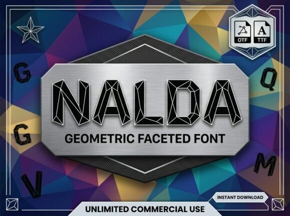
Nalda isn’t a font you read—it’s one you recognize. As a display font, it leans hard into geometry: circles rendered as perfect arcs, terminals cut at crisp 90-degree angles, letterforms built from consistent stroke widths and balanced negative space. It doesn’t mimic code or circuitry, but it *resonates* with that language—like the visual equivalent of a well-structured API response. Its personality is calm authority, not flashy futurism. That makes it unusually versatile: it reads as cutting-edge in a gaming teaser, grounded in a tech newsletter header, and refreshingly precise in a SaaS product demo graphic.
Where It Shines (and Where It Steps Back)
In real campaign use, Nalda excels where brevity meets impact:
- YouTube thumbnails: At 120px tall, its uppercase “TECH” or “LAUNCH” stays legible even when compressed and scaled down—no fuzzy edges, no collapsed counters.
- Instagram post headers & Reels covers: Works especially well over subtle gradients or dark UI-inspired backgrounds. Its even weight distribution prevents visual vibration on fast-scrolling feeds.
- Digital ads & landing page banners: Paired with a neutral sans serif for body copy, Nalda creates immediate hierarchy—no need for oversized shadows or outlines to make the headline “pop.”
- Pinterest pins & webinar banners: Holds up beautifully at small sizes when cropped tightly—ideal for vertical layouts where every pixel counts.
But here’s what I’ve learned: Nalda isn’t meant for paragraphs, disclaimers, or dense feature lists. It’s not a workhorse text font—and trying to force it into that role weakens both the message and the brand’s clarity. I’ve seen it misused in email footers and mobile menu labels, where its geometric rigidity clashes with readability at sub-14px sizes. Save it for moments where you want the typography itself to signal category, context, and craft.
Pairing It Right—Without Overthinking
Nalda thrives in contrast. Its clean, almost architectural presence pairs intuitively with humanist sans serifs—think Inter, Manrope, or even a restrained version of Helvetica Neue—for supporting text. That combo delivers balance: Nalda sets the tone; the sans carries the information. I’ve avoided pairing it with high-contrast serifs (too formal) or expressive scripts (too distracting), unless used *very* sparingly—as a single accent word in a quote graphic or branded template pack.
For editorial-style social posts—say, a carousel explaining “5 UX Trends for 2024”—I’ll use Nalda only for slide titles and section dividers, then drop into a warm, open sans for explanations. That rhythm keeps the campaign feeling cohesive without sacrificing scannability.
Practical Checks Before You Drop It Into Production
Before locking Nalda into a client template or ad set, I always verify a few things:
- Weight range: Does it include at least Light, Regular, and Bold? (Most Nalda licenses do—critical for creating visual rhythm across assets.)
- File formats: Web-friendly WOFF2 for live sites, OTF/TTF for design tools and merch mockups.
- Licensing clarity: Commercial use is confirmed—not just for personal projects, but for client campaigns, digital products, and templates sold on marketplaces.
- Language support: Basic Latin coverage is solid; if your campaign targets multilingual audiences, double-check diacritics and extended glyphs.
- Alternates & ligatures: Not essential, but nice-to-have for customizing logo-style text or avoiding awkward letter collisions in tight headlines like “UIUX” or “CODE.”
I also test overlays early: drop Nalda over a dark mode UI screenshot, then over a light pastel background. Its even contrast handles both—but avoid placing it directly over busy textures or low-contrast photography unless you add a subtle drop shadow or background tint.
A Font That Supports Strategy, Not Just Style
What makes Nalda useful isn’t just how it looks—it’s how it behaves across touchpoints. When I built a set of branded templates for a client’s monthly tech newsletter, using Nalda consistently for section headers (“Deep Dive,” “Tool Spotlight,” “This Week in Dev”) created instant recognition—even before readers scrolled to the content. It became part of their visual shorthand.
Same goes for a recent Pinterest campaign promoting free design resources: Nalda in the pin title (“Free Figma Icons Pack”), paired with a minimalist icon and ample white space, performed better in saves than versions using more decorative display fonts. Why? Because it signaled utility, not ornamentation.
That’s the quiet strength of Nalda. It doesn’t shout “look at me.” It says, “you’re in the right place”—clean, capable, and quietly confident. For marketers building digital-first campaigns, that kind of alignment between typeface and intent is rare. And worth holding onto.