Kinder Classroom: A Playful Display Font for Digital Brands
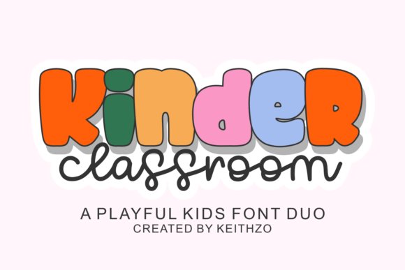
As a UI designer who ships dozens of landing pages, SaaS dashboards, and e-commerce experiences each year, I treat fonts like foundational design assets—not just decoration. That’s why Kinder Classroom stands out in my toolkit: it’s a thoughtfully crafted display font duo that balances childhood whimsy with digital clarity. It’s not a script font or a handwritten typeface—it’s a pair of expressive, slightly rounded, friendly display fonts designed for impact, not body copy.
Visually, Kinder Classroom combines soft geometry with subtle bounce—think gentle curves on uppercase “M”s and open counters in lowercase “a” and “e”. The two styles (Kinder Classroom Regular and Kinder Classroom Bold) work as a cohesive unit: one for primary headlines, the other for emphasis or layered hierarchy. Neither feels overly cartoonish nor infantilizing—instead, they radiate warmth, approachability, and creative confidence. That makes them ideal for brands that want to signal imagination without sacrificing polish.
In real web layouts, Kinder Classroom excels where personality matters most: hero section headlines, course title cards, product launch banners, and CTA buttons on conversion-focused pages. On a coaching website, pairing Kinder Classroom Bold with a clean sans serif like Inter or Manrope creates instant contrast—readers instantly grasp the human voice behind the service. In an online boutique store, it adds charm to category headers (“Tiny Treasures”, “Storytime Kits”) without compromising scannability. And yes—it works beautifully over image overlays, especially when set at 48–64px with generous letter-spacing and a subtle text shadow for legibility on busy backgrounds.
For mobile responsiveness, I recommend using Kinder Classroom exclusively above the fold on small screens: hero titles, section headings, and primary CTAs. Avoid using it for paragraph text or navigation labels—its display nature means lower readability at small sizes. At 20px or below, even bold weights begin to lose their charm and clarity. Instead, reserve it for moments where emotional resonance matters more than density: a “Welcome to Your First Class” banner on a learning platform, or the “You’ve Unlocked Joy” message in an app onboarding flow.
Visual hierarchy is where Kinder Classroom shines. Its distinct rhythm guides the eye naturally—especially when paired with a neutral, highly legible sans serif for body copy. I often use it for H1s and H2s only, then drop to a system font or lightweight webfont for paragraphs and form labels. This keeps the layout breathable and intentional. On dark mode interfaces, I add a light stroke or slight glow to ensure contrast meets WCAG AA standards. For light backgrounds, a 1–2px soft drop shadow helps lift the letters off the page without looking heavy.
Brand tone is deeply affected by typography—and Kinder Classroom communicates trust through authenticity, not authority. It tells users, “This space is safe, joyful, and made for real people.” That’s powerful for education platforms, creative studios, wellness apps, and children’s product brands. It doesn’t scream “corporate”—but it also avoids feeling amateurish, thanks to tight kerning, consistent stroke modulation, and balanced x-heights. That balance is rare in playful display fonts.
Practical pairing is straightforward: Kinder Classroom pairs best with minimalist sans serifs (Inter, Poppins, Montserrat) for modern digital products—or with warm, low-contrast serifs (Cormorant Garamond, Literata) for editorial or storytelling sites. Avoid pairing it with other decorative fonts or scripts; its personality is strong enough to hold center stage. If your brand uses a custom logo lockup, test Kinder Classroom as secondary logotype text (e.g., taglines or sub-brands), not primary wordmarks—unless your entire identity leans into hand-crafted charm.
The font includes both OTF and WOFF2 formats, full Latin character sets, standard punctuation, and basic multilingual support (including accented characters for French, Spanish, and German). There are no variable weights—but the Regular/Bold pairing gives enough contrast for most interface needs. No alternates or stylistic sets are included, which keeps implementation simple and load times low—a win for performance-conscious designers.
Licensing is critical: Kinder Classroom is a commercial font, meaning you’ll need a proper web license for live sites—even if you’re embedding via @font-face or a CDN. That license covers usage across client projects, SaaS dashboards, online stores, and digital templates you sell. It does *not* cover redistribution (e.g., bundling in a Figma community file for public download) unless explicitly permitted. Always verify license scope before deploying to production—especially for high-traffic landing pages or Shopify themes.
I reach for Kinder Classroom when a project needs soul without sacrificing structure—like a portfolio site for an illustrator launching a children’s book series, or a mindfulness app targeting parents and early educators. It performs well in social media graphics, email headers, and digital ad banners too, where split-second recognition matters. Just remember: its strength lies in brevity. Use it for short, meaningful phrases—not paragraphs, not navigation menus, not data tables. Let it sparkle where attention lands first.
Ultimately, Kinder Classroom isn’t about nostalgia—it’s about intentionality. It’s a display font that understands how people scan, feel, and decide on digital surfaces. When used with restraint and purpose, it strengthens brand identity, supports conversion goals, and quietly reminds users that good design can be both functional and full of heart.